Pages

Showing posts with label concept. Show all posts

Monday, August 9, 2010

Logo Concept - Sync

I drew up a logo concept for "Sync" in December last year, but I never got around to making it. So here I am, bored over the summer break, and hey, why not work on all those logo concepts lying around in my sketchbook? Here's my second one I've worked on during the summer break, which has been a lot more busier than I've expected.

The Design Process
Let's start with the small thumbnail sketch a jotted down. It wasn't much to work with, being a bit more than 4 cm across, but it was sufficient enough to scan into my computer and to work from there.


After scanning it into my computer, I made the logo shapes on Illustrator, and the text font in Flash. I then transferred both into Photoshop. Not being able to decide on a good colour palette, I consulted Kuler and my own experimentations with colour styles in the past. What I ended up with was a multitude of different versions, shown below here.


After talking with my friends and having them look over it, I finalized the colour palettes down to these two:


With further experimentation, and a friend who pointed out that sleek designs with plenty of curves looked good on the cooler end of the spectrum, I chose the lower one out of my finalized two. I did so somewhat reluctantly, as I felt that I've made too many logos with a cooler palette of colours than I have made warm, but looking back, I've made logos with all different sorts of colours, just that my main Notitia logo seemed to have the biggest influence on my thoughts. My doubts assuaged, I continued onto the next step, which was just a small makeover to pretty up my logo design, which, as fine as it looked, was still pretty simple. After 45 minutes or so with tinkering around on Photoshop I ended up with what you see below.


I hope you enjoy it as much as I enjoyed making it!

Discrepancies with Ford
Now I understand that many of you are aware that Ford has included a Sync system software in all their new cars, in cooperation with Microsoft. However, I'd like to point out that I made my logo and name completely separately without the knowledge of the fact that Ford had already patented official software under the same name. It was not until I was looking for colour palettes that I realized this flaw. This is merely a disclaimer showing the fact that I did not intend to copy their trademark.

Wednesday, July 21, 2010

Creature Concept - Textured

Following along the lines of the technique used by Neo Ramjet in his Making of Snaiad page (http://www.nemoramjet.com/sndmakingof.html), I used a texture (below) of what is supposedly elephant hide on Google Images, the closest thing that I thought would fit my creature.


I slowly layered this texture with Photoshop over my line drawing of my creature, which I posted a while ago in May (http://notitiaproductions.blogspot.com/2010/05/creature-concept.html).


All this layering and warping to create a believable and realistic skin texture and a seamless appearance took a lot of layers to perfect, which eventually amassed to 36 layers that I had to navigate around with. Although I guess that isn't as bad as some of the collages I made for Junior High's Grade 7 year (for me) Yearbook, which in some files reached 72 layers.

I might plan to fully add in a background with a sky and everything, depicting what it is like on its virtual planet, but that's for a later post.


Wednesday, June 2, 2010

Creature Concept Details

Skeletal Structure

Organ Systems


Muscalature

Now I'm not sure if I'm putting a bit too much detail on to my creature, but I've designed my creature from bone up in order to have it be completely biologically sound. Each of the three drawing I have made can be layered one ontop of the other in order to create the entire biological structure of my creature.


Friday, May 28, 2010

Creature Concept

A recent assignment in my art class involved fantasy creatures. As per usual, my teacher went straight into cartoon-styled creatures, a drawing style I never really liked. Instead, I enjoyed creating realistic creatures, each with an evolutionary background and history. They were all biologically possible and plausible, and this was not the first time I've decided to create an entire virtual alien ecosystem. But this time, I started off with a single creature only, and here it is:


That there is a pencil sketch of my creature design. I'll follow this up with more pictures and designs. Hope you enjoy it!

Thursday, May 6, 2010

Logo Concept - Arcani

My friend opened a conversation with me recently, asking for a logo concept. I gladly accepted, what else can I do when I'm not doing my homework, right?

After a couple minutes pouting over ideas, he gave me a rough concept of a logo idea:


It soon went from that to this:


And then this:


And finally, after 30 minutes of tweaking the font and logo around, I came up with the final design:


Arcani. Break free. That's its motto. Pretty dang awesome if you ask me.

Friday, April 9, 2010

Seaside Concept


This here is my "Seaside" concept, now fully drawn out and coloured on my computer. There's more to come as always, so I'll keep you posted.


Thursday, April 8, 2010

Protagonist


This is my first concept for the protagonist of the game. Playing the role of a civilian put into unusual circumstances, he is wearing nothing but a rain jacket and cargo pants, plus a backpack. The background here is the entrance to an alleyway, with a dumpster and a boarded window to the right. The plot in the game will be a gradual mystery for the player to solve as the game progresses. The following are a couple different versions of the concept:


Darkened Version


Pitch Black


My brother's exploding car version


Concepts

Well, this is going to be my first post in April. I know I haven't done much posting in a while, but recently, I've fallen unconscious and hit my head on the stairs while doing so, requiring surgery and a brief stay in the hospital. Well, I'm pretty certain that won't be detrimental to anything I do in the future, so all is well. In fact, I'm here to show you a few concepts I've drawn for my friend's concept game, which we're both collaborating on. Its working title is "The Only One", but we might change it in the future to fit our needs. The plot is a bit shaky so far, but hey, when you start a video game off some random drawing you find in your sketchbook, it takes a while to get off. Here's the first couple of concepts I've drawn.


This here is my first concept, "Avenue", which depicts a road littered with destruction. The office building to the left has been demolished and the park to the right is abandoned. The main character is seen walking down the avenue alone.


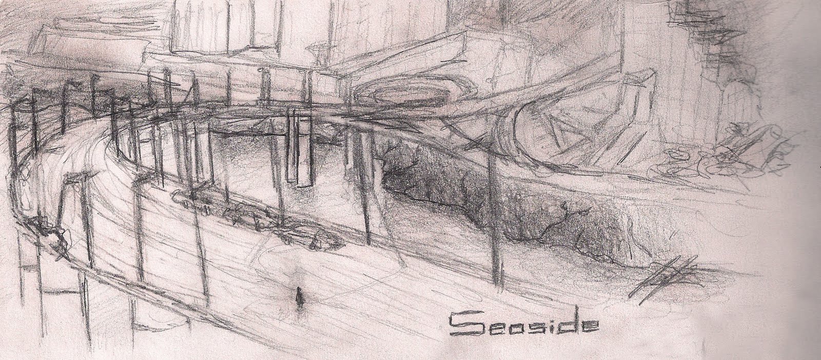
This is my second concept, which started out with me wanting to depict what an abandoned highway would look like, and then slowly it turned to a kind of bridge. "Seaside" shows that the city here is by a body of water, and this highway is an entrance into that city. The main character is seen once again walking down the highway alone, with a few abandoned cars and a single malfunctioning lamp post.


This is my latest concept, "Windows" (nothing to do with Microsoft), is one I only completed recently. It shows the main character with a backpack observing what is outside the window. The window itself is shattered with two gaping holes in it. The wall outside the building the protagonist is in has been broken through in one point, leaving it shattered and charred. This concept was to depict the thin barrier the windows make for the main character between the world outside and the relative peace within the building.

I'll be posting more concepts as I go along, so stay tuned for more in the next week or two.


Saturday, March 27, 2010

March Break Concept

Now, I know this is a little late, but here's a concept for a "March Break" design I drew in Literacy class. I would have elaborated on it further during the actual break if I was bogged down with math homework though. Enjoy!


Sunday, February 7, 2010

Video Game Design

A while back, a friend and I came up with an idea for a video game called "Fracture". We completed sketches and designs and all, but of course, it never reached past early design stages. Here are a couple of HUD  (Heads Up Display) samples as well as a planned out logo: